Using App Builder Swagger UI with Angular & Blazor Apps
Not too long ago we released Swagger UI and now we want to show you how to use it in you Angular and Blazor applications. Read the tutorial.
In this post, you will learn how to use Swagger UI for your Angular and Blazor apps in App Builder so you can quickly and easily bind data from your Web API’s to UI controls in App Builder(tm). But let’s first start by talking about Swagger and its benefits in general, OpenAPI Specification, and Swagger UI. Then, we will move on to the actual tutorial.
Here we go.
What Is Swagger?
Swagger is an open-source tool that aids in API design, development, testing, monitoring, and more.
Swagger includes 3 open-source tools:
- Swagger Codegen -Generates server stubs and client SDKs from OpenAPI Specification definitions
- Swagger Editor – API editor for designing APIs with the OpenAPI Specification.
- Swagger UI – Visualize OpenAPI Specification definitions in an interactive UI.
And 3 commercial/paid tools:
- SwaggerHub – Design & document all your REST APIs in one collaborative platform.
- SwaggerHub Enterprise – Standardize your APIs with projects, style checks, and reusable domains.
- Swagger Inspector – Test and generate API definitions from your browser in seconds.
Swagger is built to support the OpenAPI specification (previously named Swagger Specification), which is a specification for describing, producing, consuming, and visualizing RESTful web services. Using the tools included with Swagger gives developers an easy way to describe and document their APIs, with almost no effort. With OpenAPI, you describe your entire API in a JSON file, including:
- Endpoints
- Operation parameters
- Authentication methods
- Responses
- Contact information
- License
- Security
- Terms of use
- Other useful metadata
If you’re developing a Blazor or Angular app today, you are developing APIs as well. Having an accessible API using Swagger simplifies both back-end implementation and client-side usage of all the services and functionalities that your API is bringing to your Blazor and Angular applications. Here’s a closer look at what Swagger offers and its benefits.
What Are the Advantages of Swagger?
- Syncs the API documentation with both the server side and the client side.
- Usable for both developers and non-developers (PMs, end clients, and more).
- Allows you to generate Swagger REST API documentation.
- Lets you interact with the Swagger REST API.
- Allows you to automate API-dependent processes and to share your documentation with your teammates.
- Supports responses in JSON and XML format.
- It helps different tools to easily read the information about your API.
- Makes your API interactive and discoverable with comprehensive tooling.
- Allows you to integrate your API into different systems and platforms through the OpenAPI Specification.
With the popularity of Swagger, and the fact that with Visual Studio 2022 and .NET 6 API projects, Swagger UI is installed and used by default, we’ve simplified Web API consumption in App Builder with full support for reading Swagger OpenAPI definitions.
What Is Swagger UI and What Is It Used For?
Swagger UI allows developers, testers or end users to interact with your APIs through a visual and interactive web page. The web page is automatically generated from your OpenAPI Specification, and with tools like Visual Studio, it’s a single line of code to generate the Swagger UI page based on the auto-generated JSON definition of your API.
With the App Builder Swagger UI you can point to a cloud-based Swagger definition, or you can upload the JSON or YAML file that describes the OpenAPI. In App Builder, you can manage things like endpoints, parameters, inputs and more, as well as fetch and select data that will be consumed later by the App Builder components like Grid, List, Combo and all other bindable components.
How To Use Swagger UI?
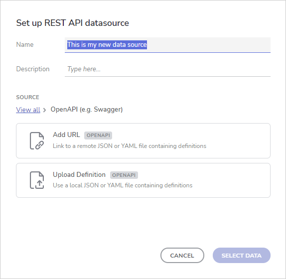
Through the App Builder Swagger UI you can easily load a Swagger definition by either uploading a file or specifying a URL. If you are already familiar with the “Adding a data source” flow, you will see no difference with the new approach

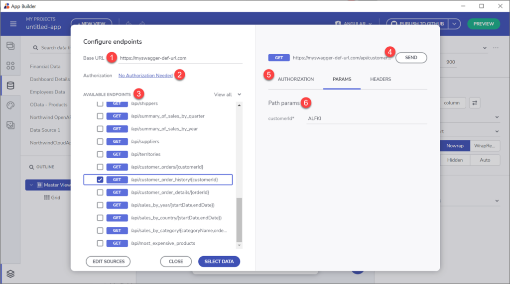
Once your Swagger definition is loaded, the Configure Endpoints dialog will appear.
The left-side of the Configure endpoints dialog consists of:
- Base URL – can be automatically populated if value for it is present in the file definition
- Authorization – provide auth key if needed
- Endpoints tree view – All available endpoints will be loaded here along with its type (GET, PUT, POST etc.)
- Request URL with Send button that can be used to test the connection before selecting i
- Tab elements for authorization, parameters and headers – if one is required, it will be marked as such
- Tab content section showing info messages or required fields.

When you pick an endpoint and set the required auth and params (if needed, based on the endpoint) you can proceed with picking a particular data field that will be later used to connect to a data consuming component. More about that in the next section.
How To Use Swagger with Your Angular and Blazor Apps?
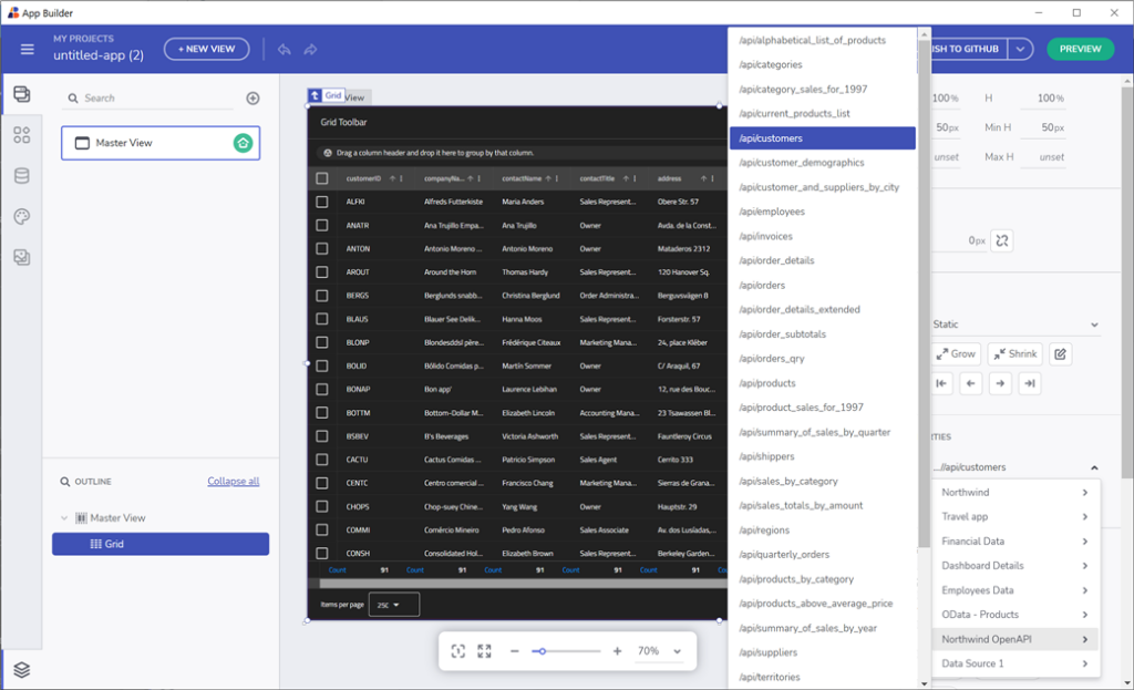
When a Swagger data source is added, users can connect a particular data field to a component section. In order for this to be done, first select the component (Grid, Card, Combo Box or any other data bound component), then scroll down the menu to locate and select the table from the Data Source that you want to connect to. Finally, connect the component section with the selected table field.
If you want to read more about component data binding, you can visit the Using data in the App Builder help doc page.

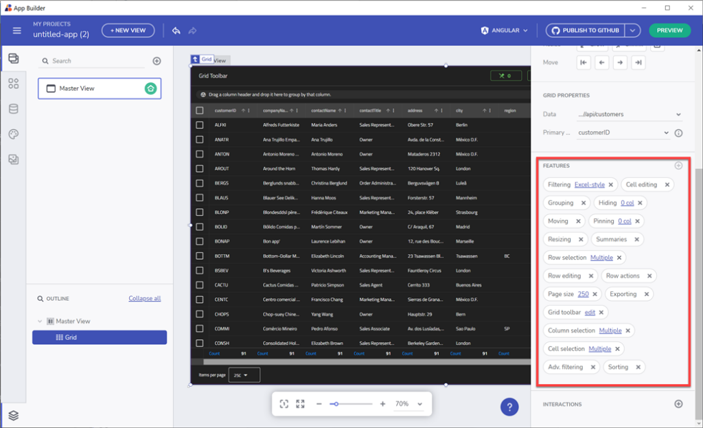
Each control that supports data binding will have additional properties in the Property Editor that lets you customize how your data is presented. For example, the Grid component has Primary key property, and the Combo Box component has Value/Display key properties. One interesting component, when it comes to data binding, is the card component. You can specify a Repeat mode (data) that will bind each record of your data source and represent it as a separate component (or a specific number of records that can be set through the “count” property).

When your app component’s data binding is ready, go ahead and check out the preview code or directly download the ready-to-use application. You can choose between developing Angular apps and Blazor app creation and code generation based on your needs. You will notice that we did everything for you, if you check the generated code, you will see a data service that will handle the requests based on the endpoint URLs that we’ve set along the process. And that’s it!
Some additional resources:
Check out this video that shows how to easily bind a Swagger UI with REST API data into Angular UI Grid or Blazor UI Grid using the App Builder.
Angular Data Grid and Blazor Grid in Ignite UI are full-featured components, allowing you to visualize your bound data as a series of rows and columns. They are packed with tons of features like data selection, excel style filtering, sorting, paging, templating, column moving, exporting to Excel, CSV, pdf formats and more.
If you want to learn how to create a full-featured Angular UI Grid from scratch, check out this video:
And don’t forget, if you haven’t done it already, try out App Builder today and check out the real-time preview of your Angular or Blazor app and code that gives you the ability to download your project as a zip file or publish it on GitHub.

