
Your Guide to UI Kits: Pros & Cons
What is a UI kit? How to use it? And what are the advantages and disadvantages? This article dives deeper into these questions, providing you with the answers and some of the best UI kits available out there.
Here are two of the most general pain points when realizing an idea into a full-featured app:
- It must be responsive.
- It must have an awesome and functional UI design.
To add even more challenges to this, teams must:
- Tackle tight deadlines.
- Fit into a strict budget.
- And maneuver across multi-channel communication between departments to stay updated regarding the progress of their project.
Isn’t it mind-boggling?
One way to tame the accumulating chaos, especially in terms of design-to-code processes and delivering compelling UX, is by adding a digital product design platform into your process.
What specific benefits do you get?
A key part of these platforms is not just prototyping, user testing and design to code, but UI kits which serve as the foundation of the design system that makes up your digital product.
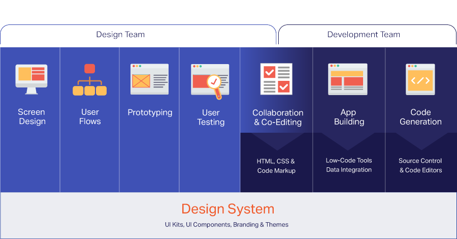
And while all of this happens blazingly fast, both technical and creative minds should not sit idle. To confront the digital transformation which is, well, constantly transforming, they must establish better practices within software product teams that will facilitate their workflow and speed up the design and development process of an application.
What Is a UI Kit?
UI kits are comprehensive sets of pre-built components and graphic files that include all aspects of an organization’s design system which dictates the guidelines for what should make up the app design, including:
- UI Components
- UI Patterns
- Screen Templates
- Iconography
- Fonts
- Color Palettes
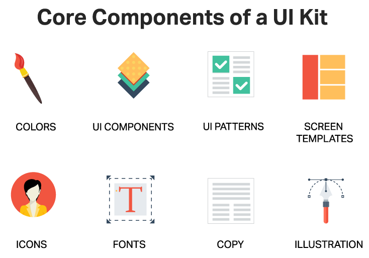
With the goal of saving time and having standards across all app design, UI Kits streamline screen creation and accelerate your development cycle. A well-designed UI kit will include a wide range of patterns, colors, and font options for further customization, and full code generation to help you build interactive apps faster than even before.
Another reason why UI kits have emerged and have steadily become so mandatory is because UI kits coupled with UI component sets can bridge the gap between designers and developers. For a long period of time, the creative agents and the tech-savvy brains seemed to occupy and operate in distinct realms. But with the focus of management on delivering more digital transformation projects faster, the necessity of UI kits that have real UI component twins is imperative. This truly accelerates digital transformation projects, teams are granted real-time visual collaboration, simple and yet creative screen design approach, faster code generation, prototyping, and user testing all in one environment. The mismatch between what is designed and what is delivered disappears.
In the fast-paced tech world where product teams speak in different terms and usually work with a different pace, tools, and techniques, UI kits feel like the first sip of coffee on a Monday morning, which somehow promises to reduce the stress of doing heavy tasks. Such design and development accelerators not only result in cost-optimization and reduced development time, but they create next-generation development environment too.
How to Use UI Kits
Using UI tools is pretty simple and easy and it doesn’t require any set of specific technical skills different than the ones you have already gained. Usually, UI kits let you design and develop apps using a visual builder. There is a toolbox that includes various components and themes, data sources and so on, that help you assemble the design, continue development and generate the production-ready code once all is done. All of this without having to write any CSS or use any markup language.
To use the Indigo.Design UI Kits in Sketch, the first step is to download then install the design system as a new Library in Sketch. Read on to see how this works.
- Download the Design System by logging into Indigo.Design, selecting Getting Started, then the Download button highlight in this image.
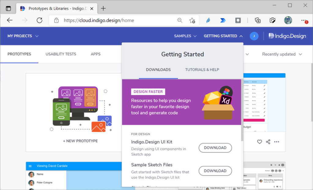
The Indigo Design System contains a Sketch file with 26 Pages in the Pages section which break down like this:
- Styling Pages: all the styling assets such as Material Icons, Colors, Typography, Elevation, and Illustrations can be found in the five pages on top.
- Component’s Pages: a vast set of Components to layout your design ideas. Through various presets available in the Sketch insert menu and overrides for states and layouts to configure in the right panel of the Sketch UI, you can create layouts compatible with Ignite UI for Angular and our code generation engine.
- Patterns Pages: the components shape up meaningful patterns for productive application design that can be found spread across the remaining pages.
- Next, open the Sketch app on your Mac, click on the Sketch item from the Apple Menu, and select Preferences.
- In the dialog, select the Libraries tab and click the Add Library…
- Navigate to the folder where you have downloaded the library.
- Select it and click Open.
- Make sure it shows up in the list in the Preferences dialog and that it is checked.
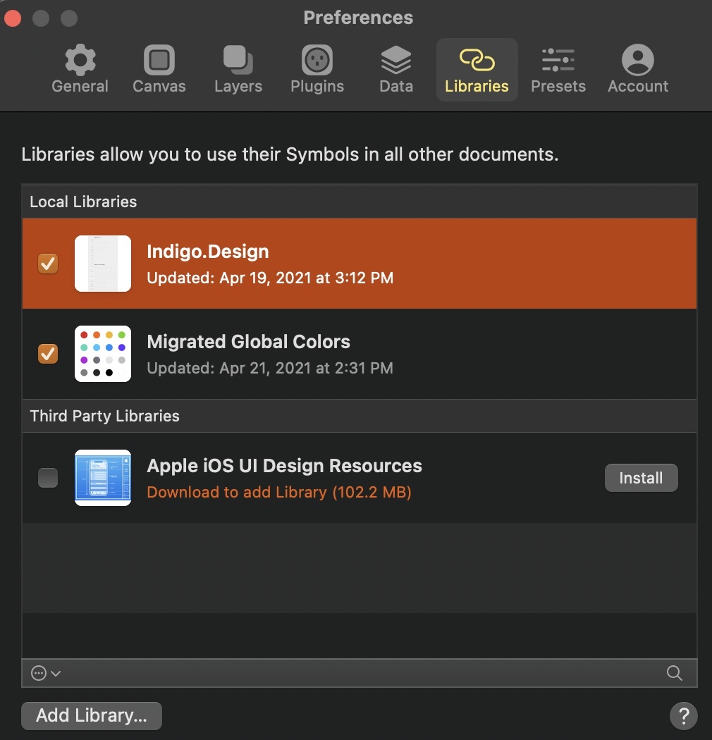
You may have noticed that in the image above, the library also appears to be present in the Sketch cloud, and as an alternative, you can use this mechanism in Sketch if you are running version 57 or later. The setup is very easy, you only need to open the Indigo.Design Sketch file and save it in your Sketch cloud. A detailed explanation of how to set Indigo.Design as a cloud library can be found in this Medium post. Once you added the library successfully, it will show up in the Symbols section of the Insert menu in Sketch.
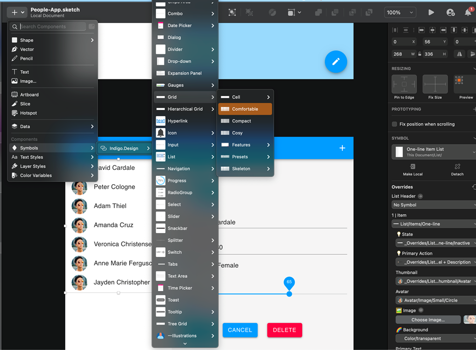
Now, you can create new applications using the Indigo Design System and the UI Kits for Sketch.
In Sketch, using the Sync to Indigo.Design plugin, you get the ability to preview the design, create an interactive prototype, review the code, and generate an entire, production-ready app directly from the design.
Advantages of UI Kits
1. One platform to rule them all: from design to code
Among the trickiest things when working on a business app is to:
- eliminate dysfunctional divisions of labor;
- establish an ecosystem that consolidates individual tasks;
- build mutual understanding so that things can happen quicker.
A lot of designers go through user stories on Jira (or some project tracking / backlog tracking tool) to start to think a bit like developers to better understand why a particular design feature was in fact seen as nothing more but 300 lines of extra unnecessary code. And vice versa. Software developers approach projects with a mindset of a designer thanks to tools like InVision. And while this helps each side break down components and patterns to some extent and understand the work of their colleagues, it is time-consuming, and teams remain separate.
Here is where UI kits shine, and specifically UI kits used in the context of a digital product design platform. They create an open culture and a single source of truth, letting both designers and developers inhabit the same online working realm. After the Covid-19 pandemic, this has become extremely important as almost everyone in the world began working remotely. In a sense, then, UI design and development accelerators answer the need for a “multiplayer” where teams meet to work together, give feedback, monitor changes and progress, and build products.
They allow teams to carry out their task on one platform – from brainstorming, designing, delivering handoffs, prototyping, versioning, and code generation to user testing and communication. Understanding the background of the design ideas and reviewing code also becomes a lot easier, where the completion of day-to-day tasks becomes much more simplified. And while designers can more easily get ideas out of their heads and start to articulate how individual features might work, engineers can preview the application’s source code in real-time.
2. The wireframing stage is dead. Long live the wireframing stage!
Each project goes through wireframing. And because the process moves back and forth between testing of page layouts, user flows, information architecture and so on, it really slows the transition between ideation and development. In the fast-pacing technological world where SPEED is everything this, in fact, needs to be resolved.
Sometimes, there is no need to waste time reinventing the wheel, and it would be much more cost- and time-efficient to replace certain practices with ready-made options and even cloneable wireframes.
With the use of good UI kits, wireframing is no longer needed as a separate stage. These tools can accelerate the project by providing pre-designed blocks to map out the overall layout and test out concepts early on. What is even more, they give a more realistic sense of what the app will involve in general.
3. Reuse to reduce (time, money & energy)
From a designer perspective, creating icons, fonts, or other detailed patterns that can be used repeatedly or changed wherever required demands time and resources. The same applies to developers who must rewrite their code according to the latest changes.
The idea of reusing components for similar or simple projects has become increasingly attractive in recent years, especially when there are UI tools to assist in this. While designers can use them to select from pre-built components, developers can more easily follow up on the changes and generate their code error-free.
In their survey2, 2020 Design Tools Survey, UX Tools highlight that:
“While almost 20% of respondents reported that they weren’t using a design system in 2019, that number dropped to 9% in 2020 (which may be attributable to the increased feature set of the more popular UI tools).”
Key insights from the study also show that the use of design systems increased among the 3500 respondents:
- from being used by 1% of respondents in 2019 to 11% in 2020 for Adobe XD;
- from 26% in 2019 to 47% in 2020 for Figma.
As UI kits become more advanced and feature-rich, they eliminate the burden of creating new complex UI patterns, buttons, headers, labels, and drop-down menus from scratch. Which would have otherwise consumed a lot of time. In essence, designers can select essential visual components and pull together pre-built patterns for common projects with copy/paste tools. If necessary, they can add customization in order to match the grand idea, to achieve the desired style of a particular design, to move the project to a development stage, and, lastly, to respond to clients’ needs. With the option to save the entire work as a library, elements, shared styles, and pattern can be easily reused on multiple other projects. And since they will have already been implemented on previous apps, testing, errors, and broken code will be reduced significantly.
4. Starter Layouts, beautiful templates & a ground for learning
Here’s the thing about great UI kits – they redefine how apps are designed and built. Using such tools allows apps to be created in record time with pre-built templates and functional layouts that all fit together with branding and styling guidelines in a way that makes your app look and work amazing to management but, more importantly, to the end users that will use it every day.
This is the way when it comes to speed and efficiency. Featuring predefined components, the UI templates and layouts are adjustable and easy to customize when needed. In other words, you get the base and also the freedom to experiment. While doing so both designers and developers can learn how to design and build similar components. They are offered a way to look inside the construction of elements, fonts, colors, and icons and can determine practices for design and development that work best for them.
5. Brand consistency & no more “about-us-page-vers-5-2-final-final-version.jpg”
Nowadays, we focus on retaining functionality and consistency rather than only creating them. Yet, while juggling tons of tasks – creating icons, page layouts, buttons, delivering mockups, fighting tame frames – the consistency and functionality may get lost. Especially when dealing with conflicting files, versioning, and file management.
With designer and development UI accelerators, you have a single source of truth that helps build and preserve brand consistency with one-click options.
Choosing among an array of pre-built features, themes, typography, and colors makes it much easier to build and retain the corporate branding across the entire app. Furthermore, even when changes need to be made, you no longer must dig through countless files and versions of an image, icon, or page. Updates are done quickly by changing only a few layers.
Disadvantages of UI Kits
When compared to the pros and cons, the advantages of UI tools seem to outweigh the disadvantages. However, a few notes need to be underlined.
1. Very little room for personalization
Customization is available when using such kits and can be applied to features like fonts, colors, and layouts. Yet, there are some limits to it. If your goal is to stun end-users with uniqueness and a specific look, you might not be able to achieve it because the components and styles are predetermined. Due to their fit-them-all nature, icons used on your design could be seen on other apps and websites, too.
Although this is not so bad as it preserves consistency across the design, the lack of complete visual differentiation could be considered a downside if the goal is to differentiate the user experience. Still, there is room for adding customization to some elements.
2. Incomplete kits – thousands of features… but all the same
Even though most of the UI tools in kits include plenty of components, not all the tools can supply designers and developers with exactly what they need. No one will be happy if there are thousands of features included but they represent just a set of elements in different colors.
3. Costly monthly plans
Other times, you can get it all – an abundance of customizable features, stunning templates, functional layouts, and instant code generation – but at a certain price. And that price can jump to hundreds of dollars for a monthly plan. In the end, you may decide it is better to save and instead summon your creative and technical skills to do the job on your own.
The Top 5 UI Kits that Streamline UI Design and Development
- Adobe XD UI kits
- Figma UI kits
- Flutter UI kits
- Sketch UI kits
- UI kits for Indigo.Design
- App Builder
While the UI kit examples above are mainly focused on streamlining the work of designers, development teams are still somewhat left out. App Builder, however, is the world’s only digital product design platform that offers a complete design-to-code solution and serves as a unified working platform for managers, designers, and developers.
It is a brand-new 100% cloud-based drag-and-drop tool that delivers a complete WYSIWYG design experience. It includes over 60 optimized UI components to help streamline designing, prototyping, user testing, app building, and code generation. While it covers all that, it simultaneously eliminates heavy design handoffs and reduces application development time by 80%.
With the new App Builder, everything designed results in production-ready Angular, Blazor, and Web Components code. You can see this right away as you create or extract a complete zip file of the app.
Also included:
- Library of pre-built app scenario-based templates and web-based layouts
- Over 60 UI Controls in the Toolbox ready for drag & drop
- Application/ Component interactions: Navigate To; Open / Close; Show / Hide
- Pre-Set Themes and Custom Themes for Material; Bootstrap; Fluent UI
- Options for custom themes
- Uploading Sketch and Figma files to App Builder
- Connect to Live Data or Upload a JSON File
- Full code generation
- Instant App and Source Code Preview
- Integration with GitHub for Design/Dev Collaboration
There is a lot more to discover about how the Indigo Design System empowers designers and developers. In case you want to dig deeper into it, here is a useful video library on YouTube with quick overviews and tips on how to use App Builder for your projects.
- Forrester, The Six Steps For Justifying Better UX, Dec 28, 2016
- UX Tools, 2020 Design Tools Survey, Taylor & Jordan, Dec 2020

