
A Comprehensive Guide to the Designer-Developer Handoff
What is a designer-developer handoff? How much time does it typically consume of your development work? And how can teams handle it better so the design-development process runs smoothly? Here are the answers.
Whether you’re a startup, an established tech giant, or somewhere in between, it’s virtually impossible to get a product from idea to launch without navigating an array of handoffs, back-and-forths, and iterations.
A key source of friction is that designers and developers traditionally perform very different tasks when creating a product. Therefore, one handoff that often plagues even the most mature product teams is that between the designer and developer.
Today we’ll dive into the design-to-dev handoff and explain how to use some solutions like:
- Flawless and better communication between cross-functional teams.
- Using automation tools with rich UI kits and development features.
- Clarifying details like where all the design assets live so teams can quickly and more easily keep track of them.
So, if you want to learn all about the how-to ways of handling these handoffs, this guide is for you.
What is the Developer Handoff and Where Does it Break Down?
The developer handoff is often the most critical — yet frustrating — stage in the development process of a digital product: the stage when a design or prototype is ready for developers to implement.
One of the problems with the designer-developer handoff might lie in the terminology itself. “Handoff’ suggests that the design is handed to the developer, and it’s now the developer’s responsibility to bring the product to life. However, no design is complete until the product is used by users. Therefore, it’s imperative that designers and developers communicate throughout the design and development phases.
In the traditional workflow, designers work in silos, between the discovery phase and development, to create pixel-perfect mock-ups based on a brief. Then, after client sign-off, they’d throw them over the wall to the developers. This process is fraught with problems. Because even though designers go to great lengths to create digital solutions that are perfectly measured and consistently crafted, designs and design systems do not fluently translate to development systems.
Part of the problem is that the more the designer does to a UI, the more they must communicate to a developer. So, it is not enough to hand over a Sketch design file, for example, and leave the developer to run with it. Designers must provide design specs that explain how all the moving pieces need to be laid out, spaced, styled, colored, engaged with and so on. It has been the only way to ensure that an app ends up pixel-perfect in the end. Even then, it still requires a lot of implementation on the part of the developer once they are inside their IDE.
Developers are not typically in the habit of coding with HTML and CSS, which is tedious work and only represents the UI. There is a lot more code behind the scenes that makes a web app work and not all developers are adept at or interested in learning to write the UI markup. When they are forced into this position, the steep learning curve adds more time to projects and the resulting reworks and debugging sends costs spiraling out of control.
Improve Designer-Developer Communication
Over the years, we’ve looked closely at the breakdown between designers and developers and we’ve identified areas where improvements could create a faster, less contentious, and more streamlined handoff. Good communication is key in pretty much any relationship, so it makes sense that it’s a requirement for a smooth design-to-dev handoff. Communication breakdowns can result in all kinds of issues and misunderstandings — even in different interpretations of the same goals, which can lead to confusing or downright bad UX. And no product team has time for that.
Common problems caused by a bad designer-developer communication are:
- Unnecessary, multiple feedback loops between designers and developers
- Unexpected quality assurance issues, or QA issues that are more time-consuming than anticipated
- Inability to leverage overlapping skills
- Failure to properly take advantage of new tools that would likely make collaboration easier.
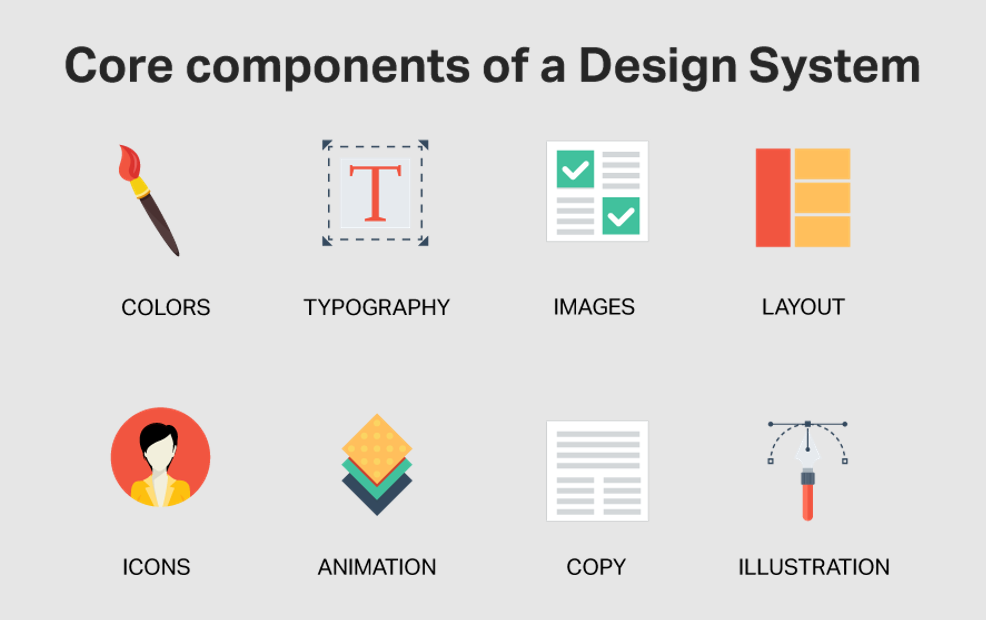
Use a Design System
“Design systems are an investment. Many companies don’t employ people to focus on design systems until the inefficiencies of not having one become too painful to bear.”
– Diana Mounter, GitHub
A design system, in simple terms, represents a deliberate inventory of UX patterns and brand style guides that are then realized as matching software components that can be reused or contextualized for building software applications. A design system can also be extended to contain voice and tone guidance for writing content, page templates, and even user flows. It is handcrafted for each organization’s specific application domain and usage context. Above all, it serves as a single source of truth for product teams when building applications and represents a collaboration contract between design and development.
Without a design system, designers don’t have clear parameters that constrain their work. They might get too creative and create inconsistencies that lead to bad user experiences and frustration for developers. All of this hampers the handoff process.
Get Developers Involved Early
As mentioned earlier, a common mistake that teams make is waiting for the designers to do their work first and then passing the product design to the developers. Not only can this be confusing, but it’s also a bit condescending (“Here you go, I’m done, bye!”).
To make the handoff more successful, a best practice is to bring the developers in early with these steps:
- Include the lead developer on the project (or the UI developer at a minimum) in the initial ideation discussion
- Include development in every meeting where screen design and interaction design is discussed
- If you in an agency, include development in conference calls with clients
- Seeking insight from developers on how design elements would likely translate to a web application or a mobile application vs. a desktop application
- Running initial design ideas past developers, so any potential issues with code can be identified when it is easier to adjust
Do Lunch — Or Remote Get-Togethers
Instead of letting everyone work in silos, bring everyone together at least occasionally. Encouraging your whole team to have lunch together is a significant step towards spontaneous idea sharing. Additionally, if physically possible, consider putting the team members working on the same function together in the same room.
If you have designers and developers working in different locations, set up virtual meetings from time to time and let them discuss their work progress. It’s amazing what a little human interaction can do for your work environment—and your product outcomes.
We’ll also discuss shortly how engaging designers and developers earlier in the process can be dramatically enhanced with a complete design-to-code system.
Provide Design Files and All Necessary Assets
A part of each designer’s responsibility is to set the developers up for success.
One of the first things that can help you achieve that is by providing the developers with all the necessary design files and assets. Go back to your plans: did you agree to do it all via Dropbox, Google Drive, or some other tool? Communicate where those assets live and keep the lines of communication open to address any missing pieces, questions, or concerns.
Have a Handoff Meeting
Having a handoff meeting is one of the most effective ways to execute a proper handoff between the design and development teams. It’s a great way to get everything out in the open, to address burning questions, and to get the whole team excited and motivated for the work ahead. Hash out any quirks and questions from both sides, and prepare for what’s to come in the development, QA, and launch phases. Set clear timelines and expectations, naming the specific individuals tasked with ensuring each phase makes it across the finish line.
Consider encouraging a mutual understanding of basic skills and concepts by providing new resources to learn from. For example, it spurs the designers to learn the basics of coding to better understand why some designs cannot be translated into functional code. At the same time, it helps the developers learn more about design and how different design elements are used.
Figma Developer Handoff
While tools like Figma promise a streamlined developer handoff, it is not really the case. The problem with the Figma developer handoff or Sketch developer handoff, is they are doing the least complex part of what really matters to developers. In a developer handoff tool, the goal of the developer is to minimize development time, reduce coding time of complex UI and accelerate team productivity. Most of these developer handoff schemes in Figma or Sketch are purely a copy/paste of HTML or CSS (or “Markup”) for a specific UI element on a screen. The developer still needs to write the complex screen code, including layout, positioning of UI elements and ensuring the UI element code “handed off” from the design tool is correct.
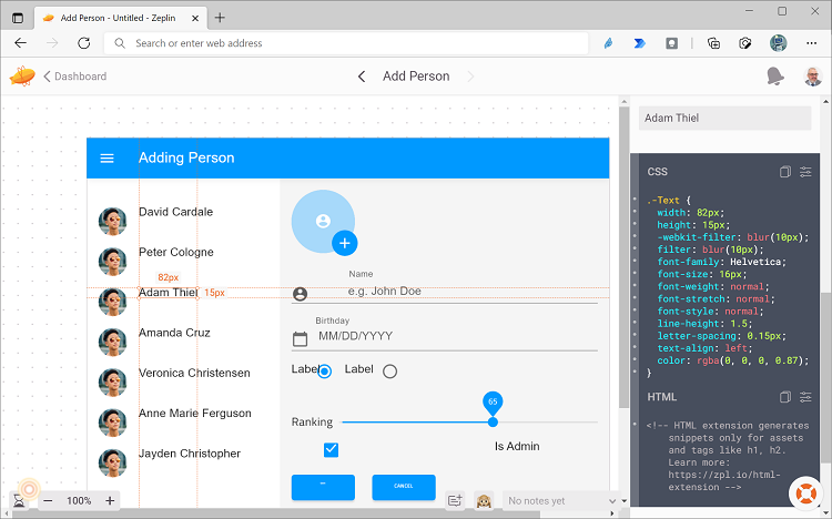
Typical example of what a developer handoff looks like in Figma or Sketch
With low-code App Builder™, you get the same concept of Figma developer handoff or Sketch developer handoff, but if you read on, you’ll see that our tool takes this developer handoff to another level.
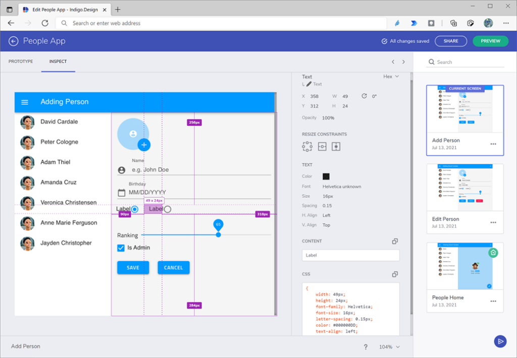
Example of what a Code Markup / Red Line tool looks like in App Builder.
App Builder Developer Handoff
As briefly mentioned earlier, a key part of improving the design-to-dev handoff is efficiently turning designs into HTML code. Many design platforms focus almost exclusively on the design part and then use plug-ins and other workarounds to prepare design files for the developer.
But what if you had an entire platform that is focused on design-to-code —a single digital development platform that allows for design and prototyping but also generates full, pixel-perfect Angular code in just a single click.
What would this look like using Sketch as an example?
With App Builder and our UI Kit for Sketch, everything you create in Sketch (available for Figma too) uses a design system, so all the styling and themes specifications match real Angular components. With the click of a button, you can generate high-quality HTML, CSS, and Angular code, right from your design.
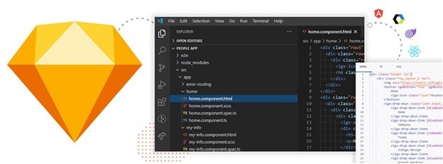
App Builder gives you 2 options for going from design to code:
- Use the Visual Studio Code plugin to select components or screens and let the cloud-based service generate code and inject it into your existing Angular app.
- Drag your Sketch file directly into your workspace in App Builder and use the WYSIWYG designer to continue editing your design or simply get your code with 1 click.
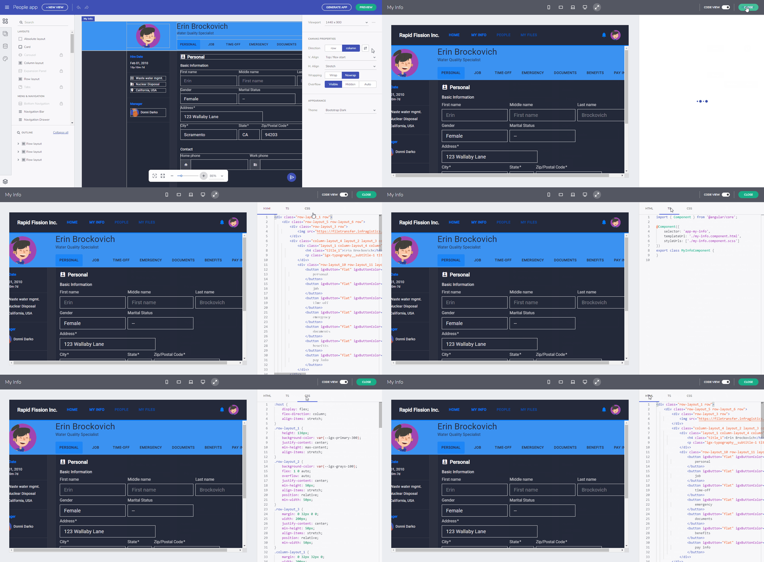
What a developer really wants – production ready code that can be used immediately in their app.
Here are parts of a Sketch code export:
- All Sketch assets are imported from a project file
- Not all designs have layers structured for HTML output, so it is important to use a tool that analyzes and restructures the design elements as needed for high quality HTML output.
- You can convert design elements to HTML elements like button, input, or select as needed, and visually edit elements, group and organize them manually.
- You can publish your design and share with others, allowing everyone to download the HTML/CSS output.
- It relies on HTML and CSS only, does not use or assume any Javascript in output. A developer can use the output HTML with Angular, React, VueJS or any other frontend library.
App Builder stands out because of the quality of our code. Infragistics is not a Johnny-come-lately to the challenge of producing the best quality UI components; we have been at it for 30+ years. We have built components for Fortune 500 companies that rely on our grids and charts every day to handle real-time financial transactions, power conversion for large-scale infrastructure, or streaming IoT data.
We generate clean production-ready code that is usable, debuggable, and can stand the test of time. And you get the whole package, design tool compatibility, design systems, UI kits, prototyping, user testing and 100% production-ready code generation.
Breaking Down the Barriers
Lots of activity is happening as companies recognize that releasing better apps, faster means reducing the handoff barriers. New approaches should focus on banishing the idea of the “handoff” and have designers and developers start working together earlier and more often. Have in-person or remote get togethers, communicate more, solve problems together, and use tools such as design systems and design-to-code software that dramatically reduce the time to ship. Design-to-code software, in particular, helps reduce miscommunication, reduce errors, and lower frustration levels by providing one place for designers and developers to reference. And it lets everybody in the digital product design process, including stakeholders and testers and users, contribute more easily and effectively to a final product that everyone can be happy with.
To see how our WYSIWYG App Builder helps accelerate design to code and delivers on the promise of real design to developer handoff, watch this quick video and sign up for a trial, or you can watch this comprehensive App Builder product overview and tutorial below to learn all about its features and capabilities and get started with it.
If you have any questions, shoot me an email at jasonb@infragistics.com and let’s discuss.

